Managing Color Rendering Intent Mismatches When Converting Adobe RGB Artwork to Spot Color Libraries
Managing Color Rendering Intent Mismatches When Converting Adobe RGB Artwork to Spot Color Libraries
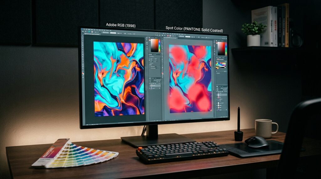
When you convert Adobe RGB artwork to spot color libraries, you need to think about color management or the colors can shift in surprising ways when the job is sent out for professional print production. Often, Adobe Photoshop designers will find that a calibrated monitor will display colors different from those spot inks accessible to commercial printers. These discrepancies are especially evident when designing brand identities, product packaging, promotional visuals, and corporate marketing materials where consistent color reproduction is essential. The rendering purpose strongly influences how colors that fall outside the target color range are treated during color space conversion. However, turning RGB artwork to spot colors is more than just choosing a rendering intent. Spot inks are unique formulations for printing, not just generic RGB or CMYK values. Understanding ICC profiles, gamut limits, spot color libraries, and the difference between process and spot printing helps designers avoid false color matching. A good workflow will have correct color references, proper conversion settings and physical proofing if color accuracy is really important. Control of these variables allows designers to minimize color incompatibilities, maintain brand consistency, and create artwork that meets the pragmatic requirements of commercial printing.
On Adobe RGB and Spot Color Reproduction
Adobe RGB is a wide-gamut RGB color space that can represent more colors than sRGB, especially in the cyan-green range, and is used in photography, digital graphics, and professional image processing. Spot colors are not hues made from mixing red, green and blue light, but are actual inks that are mixed to print. A spot color can be a conventional ink reference or a proprietary recipe developed by a printing vendor. As both systems define color differently, an Adobe RGB value cannot always be translated to an identical spot ink equivalent. Many of the highly saturated hues in the RGB spectrum, including many common spot color choices, are not reproduced by traditional printing inks. Such hues, when translated, may lose their vividness or may take on a different hue. To this end designers should differentiate between numerical color conversion and selection of a commercially accessible ink that visually approximates the original artwork. The final appearance is also affected by the type of paper material, ink formulation, printing method and viewing conditions desired. Understanding these constraints ahead of time helps set reasonable expectations and prevents wasteful tweaking just because the monitor looks wrong.
Introduction to Rendering Intent in ICC Color Management
Rendering intent is how a color management system handles colors when mapping from one color space to another with a different gamut. Perceptual rendering intent tries to preserve the relationships between colors, modifying the whole image as appropriate. In relative colorimetric rendering intent, colors that are within the displayable range are generally preserved, and colors beyond the displayable range are mapped to the closest displayable equivalents. Absolute colorimetric is most beneficial in certain proofreading circumstances when the white point of the destination media must be simulated as well. The saturation rendering intent trades off color accuracy for the sake of color vibrancy. It is often connected with business graphics operations. The results are specific for the profiles and for the color management system. These variables can affect RGB to CMYK conversions and soft-proofing in Photoshop, but they do not auto select or generate a corresponding spot ink. A rendering intent cannot duplicate an out-of-gamut color perfectly using an unavailable ink. So intent rendering is only half the story in terms of spot color operations. Designers must determine the planned spot ink separately, check the reference values, and check how the artwork will be divided for the final printing process.
Detecting out-of-gamut colors before conversion
Identify colors in the Adobe RGB artwork that cannot be accurately reproduced by the specified printing technology and convert them to spot color equivalents. When you have the suitable destination profile, Photoshop’s color management and proofing features can assist you see where the gamut may be limited. Set up your proofing environment with the correct printer or production profile and check super saturated colors, gradients and important brand colors. The Gamut Warning tool may indicate colors beyond the set proofing gamut, however the warning should be considered a diagnostic help rather than an accurate prediction of the final printed look. Spot inks have their own color capabilities. A conventional CMYK gamut warning is not a complete description of whether or not a given spot ink can match an Adobe RGB color. When you want a certain ink, get trustworthy spot color reference info and visit your print provider. Before making any changes, write down the original RGB values and the spot color reference. This record provides a means of comparing the converted artwork to the original and of evaluating alternative inks. Knowing the gamut early in the process allows designers to make informed judgments regarding color substitutions before the artwork reaches the production phase.
Selecting the appropriate spot-color library
If you have artwork that will be printed using pre-defined inks, it is important to choose a suitable spot color library. Spot color systems are a way to arrange references to inks, using identifiers and accompanying color standards, so that designers and printers can talk about the desired colors. Depending on the version and configuration installed, the Color Picker and related color selection tools in Photoshop may have supported color libraries accessible. Use the library stated in the printer or brand standards, not a color with a similar name from another library. The library versions and reference conditions are important since ink formulations, color standards, and published specifications may vary over time. The numerical Lab or RGB representation for a spot color is an approximation for display on a screen and does not mean that a physical print will match the monitor exactly. When considering the alternatives, compare the planned spot ink to the original artwork, and take into consideration the substrate, coating and printing conditions. For crucial packaging and identity tasks, a tangible ink guide or approved printed sample is a better reference than an on-screen swatch alone. The right library choice provides a bar for communication and lessens the ambiguity throughout creation.
Selecting Rendering Intent for RGB Color Conversion
The choice of rendering intent depends on what you want to see in the artwork and what the destination profile can deliver. Relative colorimetric intent can be useful when correct in gamut colors are vital to preserve, even if out of gamut colors lose differences as they are mapped to reproducible values. For images or intricate graphics with numerous rich colors, perceptual intent may be more suited as it can change relationships over a larger section of the image. Saturation intent might be useful for certain diagrams and drawings where the brightness of the colors is more essential than the exact color match, assuming the conversion system interprets the artwork properly. Absolute colorimetric intent is mostly used for mimicking the destination medium white point in some proofing operations. It is not normally the default intent for typical artwork conversion. You may compare the results in Photoshop by saving a copy of the artwork and selecting Convert to Profile with the appropriate destination profile and rendering intent. Do not assume one option will always be the best result; review the converted image. Most essential, please remember that these settings are for profile-based color conversion and not for creating spot ink separations directly. Once a suitable ink is selected, the document must still be prepared according to the desired spot color production method.
How to Keep Accurate Spot Color Definitions in Photoshop
Photoshop is mostly a raster image editor, and its spot color functionality is different from those of specialized vector illustration and page layout programs. The Photoshop software does include support for spot channels, but they need to be set up intentionally and are not quite the same as regular RGB or CMYK picture channels. If you need to define spot inks in the design, build the proper spot channel or utilize a source document that defines the ink correctly. Name the channel according to the accepted spot color criteria so the intended separation may be identified during prepress review. The channel’s color is a graphical representation, and the solid setting determines how the spot color interacts graphically with the underlying image information in Photoshop. But these controls are not to be confused with a direct measure of the physical look of the ink. If you add spot color channels or change image elements, save the original Adobe RGB artwork separately as an editable master. For multiple spot ink, verify that each channel has the desired right name and separation data. If your production workflow includes vector text, overprinting controls, trapping, or sophisticated separations, you might want to do such actions in an appropriate prepress or page-layout application. Proper channel management may guarantee that the correct spot inks are identified throughout manufacturing.
Evaluating Color Matches using Soft Proofing and Physical Proofs
Soft proofing is a valuable tool for previewing how artwork might appear under a specific output circumstance, but it cannot simulate all of the physical properties of printed ink. In Photoshop, adjust the proof configuration to the correct output profile, and compare the original Adobe RGB image with the simulated outcome. Check key brand colors, gradients, neutral spaces, transitions between very strong hues. If the artwork is going to contain a spot ink, be aware that a process-color proof profile may not fully show the behavior of the ink you chose. There may be a specific proofing procedure or reference system that needs to be followed to more properly assess the intended separation. Physical proofs are very useful when the color constancy is critical for commercial reasons . The look of a print is dependent on the ink formulation, substrate, coating, press conditions and viewing illumination . A coated paper reference can look very different from the same ink written on an uncoated surface. If the cost of a mismatch is high, ask for a demonstration that is important to production and evaluate it in proper lighting circumstances. Keep available the approved sample or documented color goal for future comparisons. Working with the monitor alone gives you a less solid base for your color judgments than soft proofing and physical validation.
Prepress Artwork Preparation and Spot Color Printing
Select the desired spot color and confirm the desired appearance, then set up the artwork according to the printer’s separation criteria. Determine whether the project will be printed with only spot inks or a combination of spot colors and CMYK process printing. This difference has an impact on the way the artwork should be created and the way the final file has to be checked. In Photoshop, make sure the Channels panel shows the spot channels you need, and that they have the correct picture data. Decide whether the production workflow needs overprinting, knockout behavior, trapping or special handling of overlapping spot and process elements. These qualities can have a large impact on the final printed product, and may need to be adjusted in a dedicated prepress application. Export a production copy using the format and settings permitted by the print supplier and save an editable master. Flattening a document or exporting a plain RGB image does not guaranty that spot separations will be maintained. Open the exported file in an appropriate preflight or separation-inspection tool . Check that the expected spot color names and channels are still present . Ensure that typefaces, picture resolution, bleed and other production criteria are met. With the right prepress preparation, the spot inks you have chosen are properly transmitted, rather than being reduced to approximate screen colors.
Troubleshooting Persistent Rendering Intent and Spot Color Mismatch
If the final spot color still does not seem like you want it to, you should look into the workflow systematically rather than adjusting rendering intent parameters over and over again. First check that the source artwork is using the Adobe RGB profile you want it to be using, and that the conversion process hasn’t unintentionally assigned a different profile. Next, confirm the exact spot color identifier, library version, and ink specification that the printer requires. View the selected ink against a tangible reference in suitable lighting, taking into consideration the substrate. If the discrepancy is only visible on-screen, look for problems with the monitor calibration, color management within the application, and the quality of the displayed spot color approximation. If the physical print does not match the approved proof, review ink formulation, substrate, press settings and color measuring techniques with the print provider. Instrumental measurements under specified conditions of measurement can provide more objective comparisons than visual judgment alone for critical color matching. Save the original Adobe RGB file and record the conversion settings, spot color references, and proofing decisions made throughout production. This is useful in determining whether the fault resides in profile conversion, ink selection, display simulation or printing conditions. By viewing rendering intent as only one element in a larger color management process, designers can achieve improved color constancy and create more reliable spot color artwork for professional printing.