Rerunning the ClearType Text Tuner to Fix Blurry Fonts on Secondary Vertical Monitors
Rerunning the ClearType Text Tuner to Fix Blurry Fonts on Secondary Vertical Monitors
Users routinely alter their displays in order to enhance productivity and increase workflow efficiency. This is because multi-monitor setups are becoming more widespread in professional and home office situations. Secondary vertical displays have been more popular among software engineers, authors, financial analysts, and content producers. This is mostly due to the fact that they provide extra room for reading lengthy papers, analyzing code, and managing communication platforms. Some users, despite these benefits, experience text that is fuzzy or badly displayed on vertically oriented screens. This is particularly the case after altering the layout of their monitors, tweaking the scaling settings, or upgrading their graphics drivers. Restarting the ClearType Text Tuner, which is a built-in program in Windows that makes it possible to optimize font rendering in accordance with display parameters and user preferences, is one method that is successful. Users are able to retain bright, legible text and maintain visual comfort over lengthy computing sessions if they have a solid understanding of how ClearType technology works and the reasons why recalibration is required in certain multi-monitor settings.
Gaining an Understanding of the Ways in Which ClearType Technology Improves Text Output
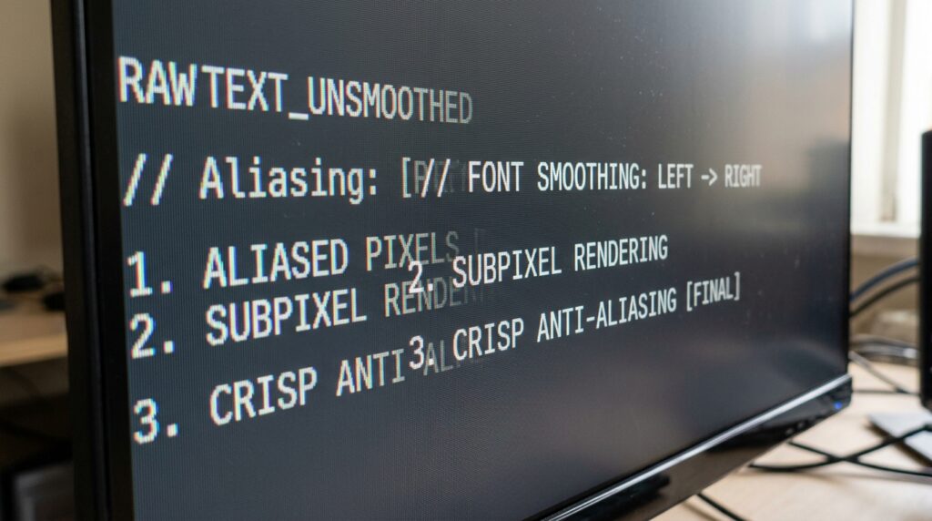
The font-smoothing technique known as ClearType was created by Microsoft with the intention of enhancing the readability and look of text that is presented on liquid crystal displays and other screen technologies that are very comparable. ClearType makes use of subpixel rendering methods in order to improve the apparent sharpness and edge definition of characters. This is in contrast to the normal practice of producing characters using ordinary pixel layouts alone. When used over an extended period of time, this method improves the clarity of characters, making the text look smoother and simpler to read. ClearType is able to provide a more refined visual experience across all supported devices because it takes into consideration the actual structure of display pixels. When it comes to maintaining the highest possible font quality, it is important to have a solid understanding of the concepts that underlie this technology. This gives a vital background for understanding why display modifications sometimes need recalibration.
The Reasons Why Vertical Monitors Poses Their Own Special Challenges
On the other hand, vertical monitor orientations bring forth various concerns in relation to display layout and visual consistency. Vertical monitor orientations give significant productivity gains. Rotating a monitor causes a change in the way text components align with the physical layout of screen subpixels, which may have an effect on the behavior of rendering. Furthermore complicating the process of font optimization in setups with several monitors are changes in resolution, panel technology, scaling choices, and refresh rates. Therefore, secondary displays that are set separately from main monitors may present variable degrees of text sharpness according to their configuration. Following alterations to the orientation of the typeface or modifications to the hardware, these variables lead to circumstances in which the fonts look less crisp. Users are better able to identify necessary remedial procedures should the visual quality of their monitors begin to decrease if they are aware of the distinctive features of vertical monitor configurations.
Some of the Most Common Reasons Why Secondary Displays Have Blurry Fonts
On secondary vertical displays, the depiction of text may be blurry or uneven due to a number of different circumstances. Changes to the display scaling settings have the potential to modify the presentation of interface elements, which may result in fonts that look less exact on occasion. It is possible for upgrades to graphics drivers to alter the behavior of rendering or to reset settings that were previously optimized. Changing the configuration of monitors within display settings or moving displays from one system to another might also have an impact on ClearType calibration. Windows must strike a balance between rendering choices across devices that have different characteristics while operating in scenarios that have displays with varying resolutions simultaneously. When users have a better understanding of these possible factors, they are better able to diagnose whether font problems are caused by ClearType setup or if they are caused by hardware faults or monitor quality restrictions.
In the context of professional workflows, the significance of readable text
It is especially important for users whose tasks include substantial reading or writing activities to have text that is clear since this plays a significant role in promoting productivity. When it comes to maintaining efficiency, developers who are evaluating code, editors who are polishing content, analysts who are deciphering reports, and researchers who are looking over documentation all rely on pleasant visual experiences. Because users are required to exert greater effort in order to comprehend the information that is shown on the screen, the cognitive strain caused by blurry fonts is increased. A lack of legibility may, over time, lead to visual fatigue and a reduction in attention. By placing an emphasis on font quality inside workspaces that have several monitors, users are able to experience greater comfort and maintain their professional performance over extended work periods.
ClearType Tuning’s Capability to Adapt to the Preferences of Users
ClearType’s capacity to integrate subjective user input into font optimization procedures is one of the company’s strengths of the font optimization software. By presenting a number of different text samples, the tuning technique gives users the opportunity to pick the versions that they find to be the most understandable and pleasant. Readability preferences might vary depending on factors such as eye acuity, monitor features, and ambient circumstances, which is something that our tailored method takes into consideration. Performing the tuning procedure once again after making substantial changes to the display guarantees that the rendering settings will continue to represent both the hardware specifications and the specific requirements of each person. By gaining an understanding of the adaptive nature of ClearType, one may better appreciate the significance of performing periodic recalibration as a component of proficient display maintenance procedures.
Helping to Maintain Consistency Across Multiple Monitor Configurations
It is beneficial for professionals who use many monitors to maintain visual experiences that are consistent across their workstation. Disparities in the quality of text rendering across displays have the potential to interrupt the continuity of workflow and provide distractions that are not essential during transitions between tasks. Optimizing ClearType helps each display convey text as clearly as possible within the limits that are particular to that display, which adds to a more uniform experience. Despite the fact that hardware variances may make it impossible to achieve exact uniformity in all situations, careful calibration may help limit the amount of obvious errors. Enhancing usability and facilitating easier movement between apps that are dispersed around the workspace may be accomplished by preserving visual harmony across numerous displays.