Converting Print-Ready CMYK Files to Web-Safe sRGB Without Shifting Vibrant Brand Colors
Converting Print-Ready CMYK Files to Web-Safe sRGB Without Shifting Vibrant Brand Colors
A big difficulty that designers and marketing professionals have is ensuring that the colors of their brand remain consistent across all platforms, including digital and print channels. CMYK files that are print-ready and designed for use in brochures, packaging, business cards, and other promotional materials are some of the ways that many companies build their visual identities. However, when these assets need to be converted for use on websites, graphics for social media platforms, email marketing campaigns, and digital commercials, it is important to convert them to the sRGB color space. The unfortunate reality is that this method often results in color changes that were not anticipated, especially in vivid colors that are not inside the sRGB gamut. These discrepancies have the potential to reduce the number of people who recognize the brand and to reduce the visual impact of marketing materials. Designers are able to maintain the integrity of their brands while simultaneously optimizing visuals for digital settings if they have a solid understanding of how color spaces interact with one another and apply effective conversion methods. By mastering this procedure, you can assure that the brilliant colors of your brand will stay as precise and uniform as possible throughout all of the client point of contact.
A Breakdown of the Differences Between CMYK and sRGB to Understand
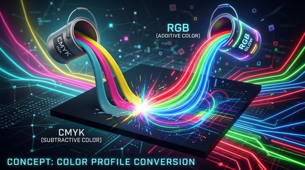
When it comes to the design industry, CMYK and sRGB go about their business in fundamentally different ways. In order to reproduce colors on physical media, the CMYK color model, which is a subtractive color model, is used largely for commercial printing. This model relies on cyan, magenta, yellow, and black inks. sRGB, on the other hand, is an additive color space that was developed specifically for digital displays. It generates colors by combining red, green, and blue light in various combinations. It is possible that some tints that are attainable in print will not be replicated correctly on displays. This is due to the fact that each system functions within its own unique color gamut. In particular, colors with a high saturation level, such as blues, greens, oranges, and neon-like tones, are more likely to undergo changes throughout the conversion process. After gaining an understanding of these distinctions, one may then proceed to make judgments that are based on accurate information throughout the color management process.
This is the reason why vibrant brand colors are susceptible to changes.
When it comes to establishing their brand identities, companies usually rely on colors that are bright and unique in order to stand out in highly competitive marketplaces. Regrettably, a significant number of these vivid hues are located in close proximity to the limits of the CMYK or sRGB color gamuts. During the conversion process, colors that are unable to be effectively represented inside the destination space are required to be changed to the closest reproducible equivalent. A decrease in saturation, a change in color associations, or a lessening in visual intensity may result from this procedure. If consistency is the most important factor in establishing brand identification, then even minute variances might become troublesome. Prior to the distribution of digital materials across many platforms, designers are able to foresee issues and apply corrective steps when they are aware of which colors are the most susceptible to attack.
Considering the Importance of Workflows for Color Management
When it comes to maintaining visual consistency throughout the design process, effective color management gives the structure that is required. It is possible to guarantee that software properly interprets color information during conversion by including accurate color profiles into print-ready files. Implementing workflow processes that are consistent helps to reduce the occurrence of unexpected outcomes and enhances predictability across a variety of output devices. Designers who implement standardized color management techniques are more suited to preserve brand accuracy while migrating between print and digital contexts. This is because they have access to more resources. In addition, effective profile management makes it easier for members of the team, printers, and digital production professionals to communicate with one another. When it comes to color management, a systematic approach helps to promote more dependable results and boosts the entire appearance of any brand.
In the process of conversion, selecting the appropriate rendering intentions
In the process of translating out-of-gamut colors from CMYK to sRGB, rendering intentions play a significant role. Depending on the desired output, some conversion processes give certain elements of color preservation a higher priority than others. When it comes to keeping general visual connections, some approaches place an emphasis on doing so, while others place an emphasis on retaining precise in-gamut colors wherever available. It is necessary to evaluate the special features of the brand palette as well as the significance of individual color values in order to choose the right rendering strategy. In order to identify which approach achieves the most acceptable balance between vibrancy and accuracy, designers should carefully evaluate the outcomes of the conversion between the two methods. When it comes to preventing undesired color changes, the selection of rendering intent with careful consideration plays a crucial role.
Consideration of Brand Colors Prior to the Finalization of Assets
It is possible to avoid discrepancies from ever reaching production settings by conducting a proactive review of brand colors prior to the completion of digital conversions. In the beginning stages of the design process, designers should determine which critical brand aspects need a high level of color fidelity and then test how those pieces look inside the sRGB color space. As a result of comparing converted versions to authorized brand standards, possible differences that need further refining are brought to light. When it comes to digital color standards, there are certain instances in which making little tweaks may increase consistency without sacrificing the integrity of the brand. This review procedure makes it possible to make educated decisions and lowers the possibility of unanticipated visual variances occurring across websites, social media platforms, and online adverts.
The Implementation of Selective Color Adjustments in Order to Achieve Accuracy
Despite the fact that automated conversions provide effective starting points, it is sometimes necessary to make extra adjustments in order to maintain strong trademark colors. With the use of selective color modifications, designers are able to zero in on certain colors that undergo considerable changes throughout the conversion process. You may assist restore the intended visual character of crucial brand aspects by fine-tuning the saturation, brightness, and color relationships of the image. In order to prevent creating new inconsistencies on other parts of the design, it is important to handle these alterations with caution. Through the whole of the adjustment process, it is possible to achieve higher accuracy by preserving reference materials and authorized color standards. The use of strategic refinements helps to strengthen the continuity of the brand across both print and digital applications.
Testing Conducted Across a Number of Different Digital Display Environments
An extensive range of electronic gadgets, such as mobile phones, tablets, laptops, and desktop displays, are used for the purpose of viewing digital assets. End users may see a different appearance of converted colors due to variations in display technology, brightness settings, and calibration standards. In order to get significant insight into the color performance of web-ready images in real-world contexts, testing them across diverse scenarios is essential. Even though it is difficult to achieve exact consistency owing to the fact that hardware circumstances might change, comprehensive review can assist in identifying important problems that may need to be solved. It is possible to increase the level of confidence that brand colors will continue to be successful and recognized throughout the digital environment by reviewing assets under a variety of viewing scenarios.
A Documentation of the Color Standards for Digital Brands
It is beneficial for organizations that regularly switch between print and digital media to develop distinct color standards for digital platforms. It is possible to generate a clear reference for future projects by documenting authorized sRGB values in conjunction with current print requirements. In order to ensure that designers, marketing teams, and external partners who are responsible for developing branded products are consistent with one another, these guidelines are helpful. Regular reviews and revisions guarantee that standards continue to be applicable despite the development of new technologies and the expansion of brand identities. Reducing uncertainty and supporting production processes that are more efficient while also promoting visual harmony across all customer-facing materials is the goal of comprehensive documentation.
The Maintenance of Brand Integrity Through the Utilization of Efficient Color Conversion
For the purpose of converting print-ready CMYK files to web-safe sRGB without sacrificing brilliant brand colors, a deliberate mix of technical expertise and strategic decision-making is required. It is possible for designers to dramatically enhance the consistency between print and digital assets by first gaining an awareness of the constraints of each color space, then adopting systematic color management operations, then choosing suitable rendering intents, and last carefully refining essential colors. Comprehensive testing and detailed documentation are two additional factors that contribute to the increased dependability of these initiatives. As companies continue to engage consumers across an increasing number of media platforms, it is becoming more necessary to become proficient in color conversion procedures. Maintaining brand colors that are true and easily identifiable eventually adds to an increase in credibility, helps to build trust among customers, and helps to create a visual identity that is consistent throughout both physical and digital settings.