Visualizing Data: A Comprehensive Guide to Charting in MS Excel 2013
Introduction:
In the realm of data analysis and presentation, Microsoft Excel 2013 stands out as a powerhouse with its robust charting capabilities. Effective data visualization is a crucial aspect of decision-making, and this comprehensive guide will explore the depths of MS Excel 2013’s charting features. From the basics of creating a simple bar chart to advanced techniques in customizing and formatting, this article aims to equip users with the knowledge to transform raw data into visually compelling insights.
I. Understanding the Essentials:
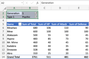
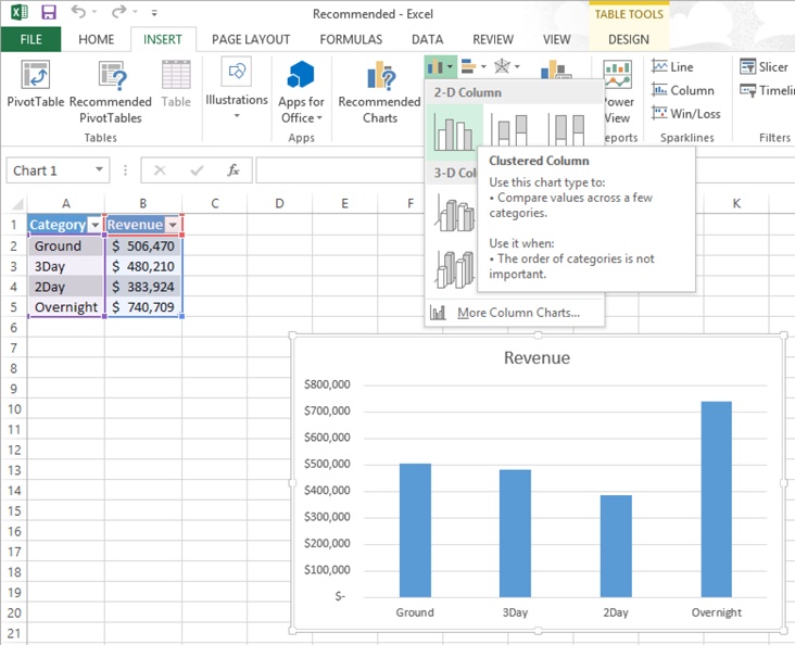
A. Introduction to Charts: Navigate through the basic types of charts available in Excel—bar charts, line charts, pie charts, and more. Gain a foundational understanding of when to use each type based on the nature of your data.
B. Creating Your First Chart: Delve into the step-by-step process of creating a chart in Excel. From selecting data to choosing the right chart type, this section will guide beginners through the initial stages of visualizing data.
II. Mastering Chart Customization:
A. Chart Elements and Formatting: Explore the various elements of a chart and learn how to customize them. From axis labels to data labels, gridlines, and titles, understand how each element contributes to the overall clarity of the visual representation.
B. Themes and Styles: Excel’s themes and styles allow users to create visually cohesive and appealing charts. Learn how to apply and customize these features to match your preferred color schemes and design aesthetics.
C. Advanced Chart Types: Beyond the basics, Excel offers a range of advanced chart types such as radar charts, bubble charts, and waterfall charts. Discover when and how to use these advanced options to convey specific types of data effectively.
III. Data Series and Axes Manipulation:
A. Multiple Data Series: Understand how to handle multiple data series within a single chart. This section will guide users through the process of adding, editing, and formatting multiple data sets for more comprehensive visualizations.
B. Secondary Axes: Explore the nuances of adding secondary axes to your charts. This advanced feature allows for the simultaneous representation of different data scales on a single chart, offering a more insightful view of the relationships between variables.
IV. Dynamic and Interactive Charts:
A. Data Labels and Annotations: Dive into the world of data labels and annotations, enhancing your charts with context and insights. Learn to strategically place labels and annotations to communicate key points within your visual representation.
B. Interactive Features: Excel 2013 introduces interactive features such as slicers and timelines. Discover how to implement these tools to create dynamic charts that allow users to explore and interact with the data themselves.
V. Practical Applications and Real-World Examples:
A. Sales Trends Analysis: Apply your newfound charting skills to real-world scenarios. Explore how to create charts for sales trends analysis, providing valuable insights for decision-makers in various industries.
B. Project Management Charts: Delve into the realm of project management with Gantt charts and timelines. Learn how to create and customize these charts to effectively visualize project timelines and milestones.
Conclusion:
In conclusion, mastering the art of charting in MS Excel 2013 is not only a technical skill but an art form. This article aimed to provide a comprehensive guide, covering the essentials of chart creation, customization, advanced features, data manipulation, and real-world applications. As you embark on your journey with MS Excel, remember that the ability to visualize data is a powerful tool, enabling you to convey complex information in a clear and compelling manner.