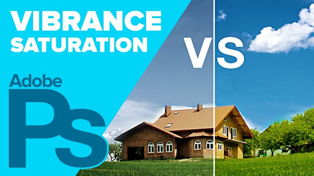
Navigating Colors: Unraveling the Difference Between Saturation and Vibrance in Photoshop
In the vibrant realm of digital imagery, mastering the nuances of color manipulation is an essential skill for photographers, designers, and digital artists alike. Within the expansive toolkit of Adobe Photoshop, two fundamental adjustments—Saturation and Vibrance—take center stage in the pursuit of perfecting hues. In this comprehensive exploration, we unravel the intricacies of Saturation and Vibrance, discerning their roles, applications, and the unique impact each imparts on the visual spectrum.
Section 1: Decoding Saturation
1.1 The Essence of Saturation
Saturation, in the context of color, refers to the intensity or vividness of a hue. A highly saturated color appears vivid and rich, while desaturation results in a more muted or grayscale appearance. Photoshop provides a dedicated Saturation adjustment layer, allowing for precise control over the saturation levels of individual colors within an image.
1.2 The Saturation Spectrum
Understanding the Saturation spectrum is crucial. Moving towards the higher end intensifies colors, making them more pronounced and vibrant. Conversely, reducing saturation mutes colors, gradually transforming them into grayscale as saturation approaches zero.
Section 2: Unveiling Vibrance
2.1 Vibrance Defined
Vibrance, a relatively recent addition to Photoshop’s repertoire, introduces a nuanced approach to color adjustment. Unlike Saturation, Vibrance aims to enhance the intensity of muted colors while preserving the vibrancy of already saturated ones. It operates selectively, avoiding over-saturation of already vibrant colors and preventing skin tones from becoming unnaturally vivid.
2.2 The Intelligent Touch of Vibrance
Vibrance incorporates an intelligent algorithm that dynamically assesses the existing saturation levels in an image. This dynamic approach ensures that the adjustment targets colors that will benefit from an increase in intensity, resulting in a more balanced and visually appealing outcome.
Section 3: Practical Applications
3.1 Saturation in the Limelight
Saturation proves invaluable in scenarios where a bold and impactful color presence is desired. It’s a go-to tool for accentuating specific colors or creating dramatic visual effects. Portrait photographers, for instance, might use saturation to enhance the richness of clothing without affecting the natural skin tones.
3.2 Vibrance’s Subtle Mastery
Vibrance shines in situations where a gentle yet effective touch is required. Landscape photographers, dealing with a diverse array of colors, can benefit from Vibrance to intensify muted tones without risking the over-saturation of already vivid elements like a clear blue sky.
Section 4: A Harmonious Blend: Saturation and Vibrance Together
4.1 Strategic Combination
Unlocking the full potential of color adjustment often involves a strategic interplay between Saturation and Vibrance. By combining these tools judiciously, you can achieve a harmonious balance, infusing vibrancy into specific colors while maintaining a natural and well-calibrated overall palette.
4.2 Achieving Natural Skin Tones
A common challenge in photo editing is enhancing colors without compromising the integrity of skin tones. Here, Vibrance proves invaluable. Its selective approach ensures that skin tones remain lifelike, even as other colors receive a boost in vibrancy.
Section 5: Practical Steps in Photoshop
5.1 Navigating the Saturation Adjustment Layer
In Photoshop, the Saturation adjustment layer is a versatile tool. By accessing it through the Adjustments panel, you can individually target and modify the saturation of reds, blues, greens, and more. This granular control empowers you to fine-tune specific elements within an image.
5.2 Embracing the Vibrance Adjustment Layer
The Vibrance adjustment layer complements Saturation seamlessly. Found in the Adjustments panel alongside Saturation, Vibrance offers a slider-based interface. Experiment with increasing Vibrance to witness its selective enhancement in action, intelligently amplifying muted colors.
Section 6: Advanced Techniques and Considerations
6.1 Masking for Precision
To elevate your color adjustments to the next level, consider using masks. This allows you to selectively apply Saturation and Vibrance adjustments to specific areas, ensuring that your enhancements are precisely targeted without affecting the entire image.
6.2 Monitoring Color Histograms
For a data-driven approach to color adjustments, keep an eye on the color histograms in Photoshop. This visual representation provides insights into the distribution of colors, guiding your decisions on where to apply Saturation or Vibrance adjustments for optimal impact.
Section 7: Conclusion – Crafting the Perfect Palette
In the expansive palette of Photoshop’s color adjustments, Saturation and Vibrance emerge as indispensable brushes in the artist’s toolkit. Understanding their distinct roles and nuances empowers creators to navigate the vast spectrum of color with finesse. Whether seeking bold and striking visuals or aiming for subtlety and balance, the dynamic interplay between Saturation and Vibrance unlocks endless possibilities in the pursuit of crafting the perfect palette. As you embark on your color journey within Photoshop, let the mastery of Saturation and Vibrance be your guiding brushstrokes, painting vivid narratives and breathtaking visuals with every adjustment.