Accessing Hidden OpenType Font Alternatives and Ligatures for Custom Digital Logo Design
Accessing Hidden OpenType Font Alternatives and Ligatures for Custom Digital Logo Design
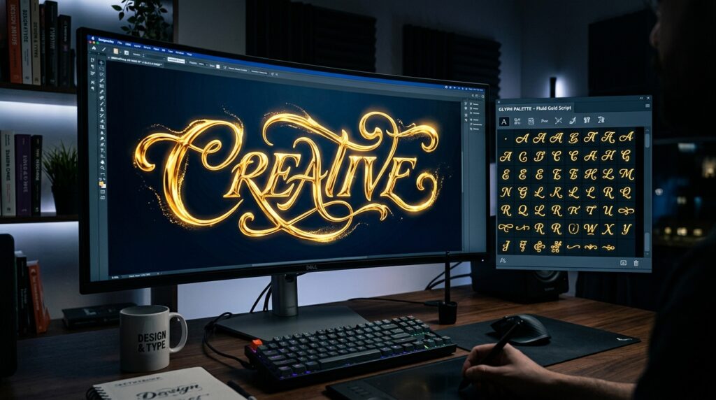
Typefaces are an essential component in the design of digital logos, since they have a significant impact on how consumers perceive the personality, professionalism, and distinctiveness of a brand. A significant number of designers fail to recognize the sophisticated features that are inherent in OpenType fonts, despite the fact that picking a right typeface is essential. For example, contemporary OpenType technology often incorporates hidden stylistic alternatives, contextual replacements, discretionary ligatures, swashes, and character variants that go much beyond the normal keyboard character set. There is no need for designers to depend only on manual letter alterations since these capabilities provide them the opportunity to build highly personalized logos. Designers are able to create unique brand identities that are distinguishable from generic text treatments if they have access to and make use of these advanced typographic tools. It is possible to improve creative freedom while maintaining the accuracy and consistency that are associated with professionally created typography in digital branding initiatives by gaining an understanding of how to discover and efficiently use OpenType alternatives.
Comprehending the Importance of OpenType Characteristics in Organizational Design
Through the incorporation of huge libraries of substitute characters and sophisticated replacement behaviors, OpenType fonts provide a substantially greater level of capability than standard font formats. These elements are crucial tools for logo designers, since they allow them to create distinctive visual identities while preserving typographic harmony. Rather than settling for the default letterforms, designers have the option of exploring different glyphs that give a brand mark a sense of sophistication, individuality, or originality. In order to separate logos from those of rivals that use the same basic font, OpenType features make it possible to make small changes. This extra degree of personalization helps to strengthen brand awareness and gives designers the ability to strike a balance between the structural stability given by professionally designed font families and the element of uniqueness that they want to include.
Investigating Different Stylistic Options for Creating a Unique Branding
One of the most helpful aspects that OpenType has to provide for the creation of logos is the availability of stylistic alternatives. While maintaining the fundamental design language of the font, these variant glyphs provide a variety of variations on the conventional characters. Modified terminals, ornate flourishes, alternate serifs, and changed stroke treatments are some examples of the differences that may become apparent. By using stylistic alternatives, designers are able to modify logos without generating errors that are often associated with combining typefaces that are not interrelated. The process of selecting relevant alternatives contributes to the establishment of unique visual qualities that are in line with the identity that a brand intends to convey. These hidden character alternatives make it possible to increase creative possibilities while still keeping typographic continuity. This is true regardless of whether the goal is to achieve sophistication, creativity, or approachability.
Facilitating Visual Flow Through the Use of Ligatures
Ligatures were first devised to overcome issues in typography pertaining to space and readability. This was accomplished by uniting certain letter pairings into unified shapes. There are chances to improve the visual cohesion and beauty of a logo via the use of discretionary and standard ligatures throughout the design process. Ligatures, when selected with care, have the ability to successfully establish smooth links between characters, so adding to a look that is more polished and memorable. There are several types that include intricate ligature systems that are designed primarily for display uses and branding endeavors. In order to achieve successful outcomes, it is vital to have a solid understanding of the situations in which ligatures enhance a design and those in which they impair readability. The inclusion of strategic elements enhances the overall composition while simultaneously enhancing the distinctiveness of the final logo.
Contextual Alternate Character Variations and Character Alterations Accessing
The use of contextual alternatives allows typography to look more natural and complex by dynamically adjusting the forms of characters dependent on the letters that surround them. It is common for these clever replacements to stay concealed until certain OpenType capabilities are engaged inside the design program. The use of contextual behavior by logo designers allows for the creation of transitions that are more seamless and letter combinations that are more balanced. There are also typefaces that provide numerous versions of individual characters, each of which reacts differently based on where they are located inside a word. Designers are able to minimize uncomfortable spacing or repeating forms by exploring these possibilities, which allows them to fine-tune typographic connections. This level of detail adds to brand identities that are more polished and visually attractive thanks to their overall impact.
Deliberately incorporating swaths and decorative elements into the architecture
A great number of OpenType fonts have ornamental extensions and decorative swashes, which, when used in moderation, have the potential to significantly improve the personality of a brand. Depending on the context of the design, these embellishments may provide a feeling of legacy, inventiveness, craftsmanship, or elegance to the design. An excessive amount of decoration, on the other hand, might make documents less readable and impair their adaptability across a variety of applications. One of the most important things that successful logo designers do is determine whether or not the ornamental alternatives really assist the brand concept, rather than just functioning as cosmetic enhancements. It is possible to create focus points that are memorable with the selective use of swashes while yet maintaining clarity and scalability. When it comes to adopting these complex typographic characteristics, striking a balance between expression and utility is still rather important.
Creating and preserving legibility across all digital applications
In addition to being visually unique, a logo has to be able to function well in a variety of digital situations. Alternatives to OpenType that seem great when seen at big sizes may lose their clarity when scaled for use in social network profiles, smartphone interfaces, or navigation elements on websites. It is important for designers to analyze logos at a variety of sizes to ensure that any stylistic adjustments or ligatures do not make the brand unrecognizable. The consistent readability of a brand adds to increased brand identification and improves the user experience across all digital touchpoints. It is helpful to uncover potential constraints before completing the design by testing customized typography under situations that are as realistic as possible. In order to guarantee that the performance of the logo is consistent independent of the application setting, it is important to prioritize usability with originality.
Complementing OpenType Characteristics with Individualized Refinements
Despite the fact that OpenType alternatives provide great starting points, professional logo design often benefits from extra human refining. In order to achieve optimal visual balance, designers may tweak the space between elements, modify proportions, or gently shift the relationships between characters. Custom additions take the design to an even higher level, while OpenType elements build a typographic base that is consistent throughout itself. In order to preserve the characteristics of the original font, it is essential to maintain the same level of consistency across all of these modifications. It is possible for designers to develop logos that are not only unique but also professionally performed by combining the intelligence of built-in fonts with careful customisation. While maintaining a high level of typographic quality, this hybrid method increases creative freedom.
Making the Right Choices When Choosing Typefaces for Advanced Features
There are a variety of OpenType fonts, and not all of them provide the same quality or range of sophisticated typographic characteristics. Certain types come with substantial libraries of alternatives and ligatures that are designed expressly for use in branding purposes, whilst other typefaces provide just basic upgrades. Before making a final decision about a certain typeface for the development of a logo, designers should thoroughly assess the capabilities of the font. Early on in the design phase, gaining an understanding of the various character sets and stylistic possibilities helps to avert complications later on in the production process. When you choose fonts that have broad OpenType compatibility, you open up additional chances for creative expression and make it easier to explore more effective ways to create unique branding solutions.
The Art of Typographic Mastery for the Creation of Unique Logos
One of the most useful strategies for enhancing digital logo design beyond the realm of traditional typography is to get access to secret OpenType font variants and ligatures. Through the exploration of stylistic alternatives, contextual substitutes, ligatures, and ornamental features, designers are able to obtain access to tools that are complex and promote the development of individual brand identities. It is possible to create logos that are not only visually unique but also highly practical by combining these sophisticated elements with rigorous refinement and usability concerns into the design process. Mastering OpenType features gives a significant advantage in the process of building identities that are memorable, particularly in light of the fact that competition for branding is becoming more intense across digital platforms. It is possible for designers to create personalized logos that convey professionalism, originality, and lasting brand value by using these typographic resources with careful consideration.