Navigating Data Visualization: A Comprehensive Guide to Utilizing the Graphing Tool in Adobe Illustrator

Introduction:
In the expansive realm of digital design, Adobe Illustrator stands as a versatile powerhouse, offering a diverse set of tools and features to empower creators to bring their ideas to life with precision and creativity. Among its arsenal of capabilities, the graphing tool emerges as a dynamic feature, providing users with the ability to visualize data in a compelling and intuitive manner. Whether you’re a seasoned designer, a data analyst, or an aspiring artist, understanding how to effectively utilize the graphing tool in Adobe Illustrator is essential for creating impactful and informative visualizations. In this comprehensive guide, we’ll embark on a journey to explore the techniques and tools needed to harness the power of the graphing tool and create stunning data visualizations that captivate and inform.
Chapter 1: Introducing the Graphing Tool
At its core, the graphing tool in Adobe Illustrator is a versatile instrument that allows users to create and customize various types of charts and graphs, such as bar graphs, line graphs, pie charts, and more. Whether you’re visualizing sales data, survey results, or statistical trends, the graphing tool offers a range of options and settings to customize the appearance and layout of your charts. With intuitive controls and flexible design options, the graphing tool empowers users to create compelling visualizations that effectively communicate complex data.
Chapter 2: Understanding Chart Types and Data Structures
Before diving into the creation process, it’s important to understand the different types of charts and graphs available in the graphing tool, as well as the data structures they support. Common chart types include bar charts, line charts, area charts, pie charts, scatter plots, and more, each suited to different types of data and analytical needs. Familiarize yourself with the characteristics and applications of each chart type, as well as the data formats and structures they require, such as numerical values, categories, or time series data.
Chapter 3: Creating and Customizing Charts
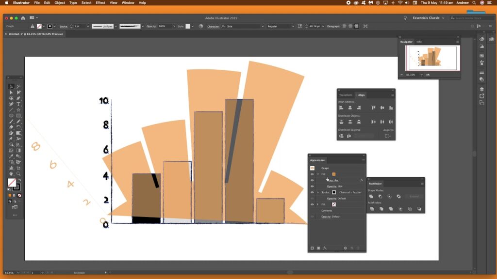
To create a chart in Adobe Illustrator, start by selecting the graphing tool from the toolbar or by navigating to the Object menu and selecting Create Graph. Choose the desired chart type from the options menu, and then input your data into the corresponding data table. Customize the appearance and layout of your chart using the options panel, adjusting settings such as colors, fonts, labels, and scales. Experiment with different chart styles and visual elements to create a design that effectively communicates your data and engages the viewer.
Chapter 4: Editing and Refining Charts
Once you’ve created a chart in Adobe Illustrator, it’s important to review and refine the details to ensure clarity and accuracy. Use the direct selection tool to select and edit individual chart elements, such as data points, labels, and axes. Experiment with resizing, rotating, and repositioning chart components to achieve the desired layout and composition. Use the appearance panel to customize the appearance of chart elements, such as stroke width, fill color, and transparency. Pay attention to details such as alignment, spacing, and readability to create a polished and professional-looking chart.
Chapter 5: Adding Annotations and Annotations
To enhance the clarity and interpretability of your charts, consider adding annotations and annotations to provide context and insight. Use the type tool to add text labels, titles, and descriptions to explain the data and highlight key findings. Experiment with adding annotations such as arrows, callouts, and symbols to draw attention to specific data points or trends. Consider adding a legend or key to explain the meaning of different colors, symbols, or patterns used in the chart. Pay attention to the placement and formatting of annotations to ensure they complement the design and readability of the chart.
Chapter 6: Integrating Charts into Your Design
Once you’ve created and customized your charts in Adobe Illustrator, it’s important to integrate them seamlessly into your design. Experiment with combining multiple charts into a single layout to compare and contrast different datasets or trends. Use the layers panel to organize and manage the elements of your design, including charts, annotations, and other graphic elements. Consider using color, typography, and layout to create visual hierarchy and guide the viewer’s attention to the most important information. Pay attention to consistency and coherence to create a unified and cohesive design.
Chapter 7: Saving and Exporting Charts
Once you’re satisfied with your charts in Adobe Illustrator, it’s important to save and export your artwork for sharing or distribution. Save your Illustrator document in a compatible file format, such as AI or PDF, to preserve the vector properties of your charts. If you’re creating artwork for web or screen-based applications, consider exporting your charts as SVG files for scalability and compatibility with web browsers. For print-based projects, export your charts as high-resolution raster images in formats such as JPEG or PNG.
Conclusion:
Mastering the graphing tool in Adobe Illustrator is a journey of exploration and experimentation, offering endless possibilities for creating compelling and informative data visualizations. By understanding the different chart types and data structures, creating and customizing charts, editing and refining details, adding annotations and annotations, integrating charts into your design, and saving and exporting your artwork, you’ll be able to create stunning visualizations that effectively communicate complex data and engage the viewer’s imagination. So grab your data, set your sights on the canvas, and let the graphing tool in Adobe Illustrator become your trusted ally for crafting visualizations that captivate and inform.


